
The identity behind the beauty
The Art of VANITY.
Discover the visual identity behind VANITY — a celebration of individuality, confidence, beautiful hair, and timeless elegance.
- Palette
- Black · Gold · Ivory
- Typefaces
- Playfair · Inter
- Mark
- Wordmark lockup
- Version
- 1.0
Brand Identity Guide · Version 1.0
The complete guide
One sheet, the whole identity.
Logo, palette, type and tone at a glance — the reference every page, post and print piece is built from.
Brand Identity Guide
A Boutique Salon · Scranton, Pennsylvania
Rich Black
#171717
Champagne Gold
#C7A77B
Ivory
#FAF7F2
Taupe
#A68F80
Headline · Playfair Display
The Art of Beautiful Hair.
Body · Inter
Neutral, highly legible sans for body copy, navigation, captions and every interface label.
“The Art of Beautiful Hair”
Brand Identity Guide · Version 1.0
Our logo
The wordmark, in three settings.
One lockup, used three ways: reversed on Rich Black, over darkened photography, and set on a black plate when the surface is light.
Primary lockup
White and gold letterforms on Rich Black. This is the default setting for the web, social and print.
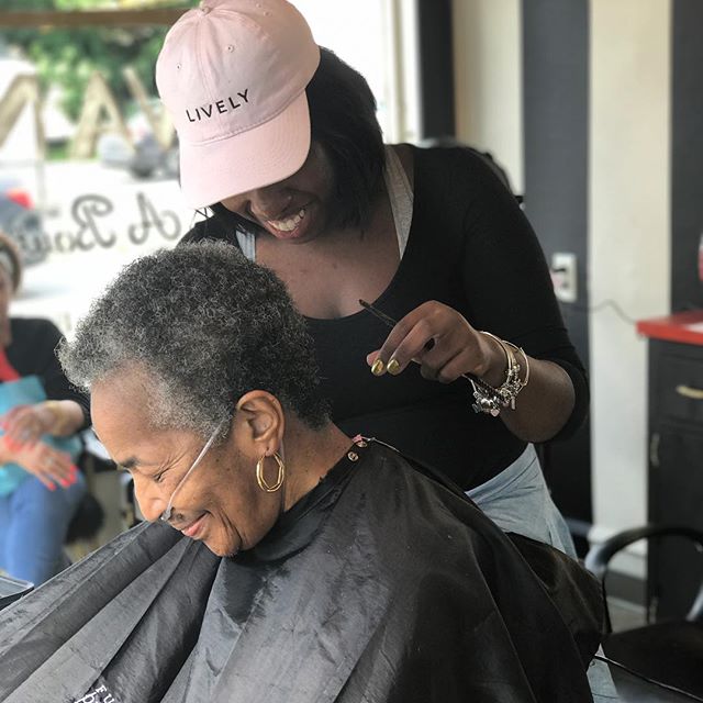
On photography
Never below 60% black overlay. The gold rule must stay visible.
On Ivory · black plate
Light surfaces always receive the mark inside a Rich Black plate, with the plate’s margin matching the clear space.
Signature mark
The compact signature is the same lockup scaled down, never cropped. The dashed margin is its minimum clear space.
Our colors
Black carries. Gold accents.
Four colours only. Rich Black sets the tone, Ivory gives the page air, Champagne Gold marks what matters, and Taupe keeps secondary text quiet.
Rich Black
The salon’s ground colour. Headlines, footers, the canvas behind the wordmark.
60% of any composition
Champagne Gold
Accent only: hairline rules, eyebrows, buttons and the italic word in a headline.
10% of any composition
Ivory
The primary light surface for editorial layouts, long copy and print.
25% of any composition
Taupe
Secondary text, captions, quiet metadata and warm dividers.
5% of any composition
Typical balance — black 60 · ivory 25 · gold 10 · taupe 5
Our typography
A serif that carries, a sans that explains.
Playfair Display holds the headlines and italic accents. Inter carries body copy, navigation and every interface label.
Headlines
Playfair Display
A high-contrast serif carrying the luxury register. Set tight, sentence case, never all caps for long lines.
The Art of VANITY.
Body & Interface
Inter
Neutral, highly legible sans for body copy, navigation, captions and every interface label.
Texture-conscious care for curls, coils and kinks, built around how your hair actually behaves. Personalised service, honest guidance, and styling that works outside the salon.
Accent
Playfair Display Italic
Italic serif for pull quotes, single emphasised words and short editorial statements. One per view.
“Hair is personal. The service should be too.”
Type scale
- DisplayPlayfair Display · 56–72 px · tight
- Section headlinePlayfair Display · 36–48 px
- EyebrowInter · 11 px · uppercase · 0.32 em tracking
- BodyInter · 15–16 px · 1.7 line height
Our visual identity
Gold sweeps and the movement of hair.
The graphic language borrows from a strand of hair in motion: long, confident gold curves that sweep across a dark or ivory ground.
Gold swooshes
Hairline curves, 0.8–1.6 px, always Champagne Gold on Rich Black.
Hair-inspired lines
Flowing strands suggest movement. Never geometric, never busy.
Editorial restraint
One graphic gesture per composition, then space.
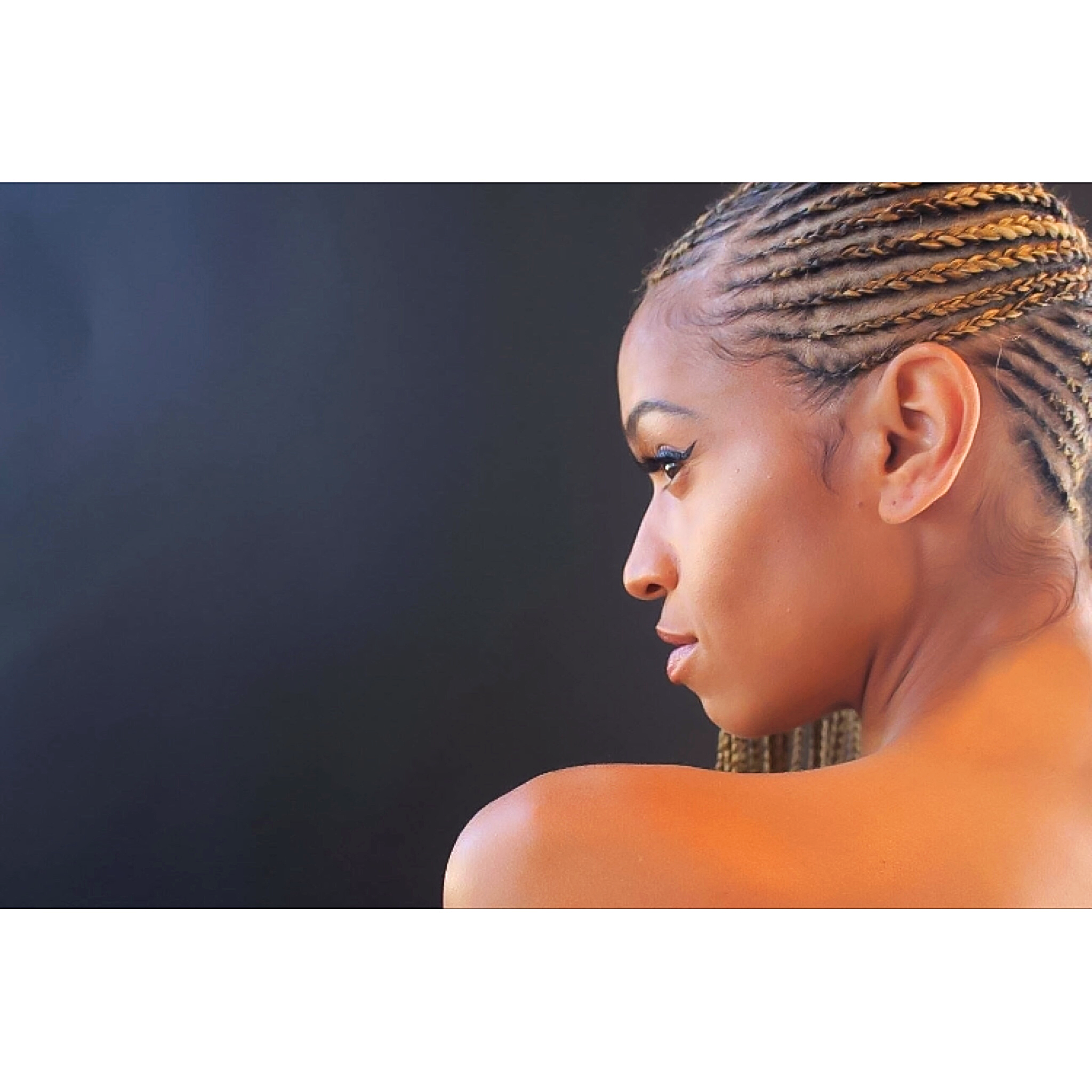
Editorial portrait
Darkened ground, warm highlight, generous negative space.
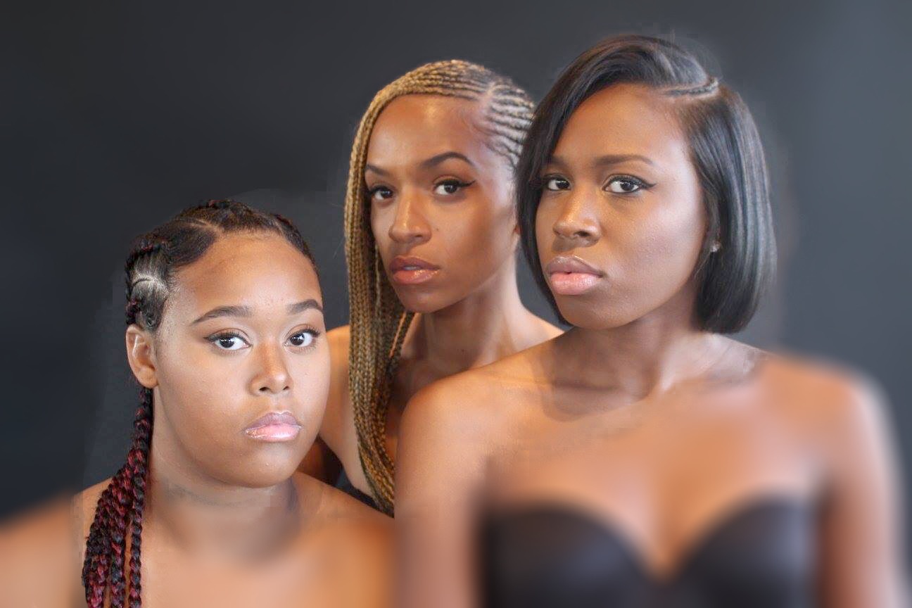
Texture detail
Real hair, unretouched texture, close crops with soft light.
Salon atmosphere
Warm neutrals, marble, brass — never a bright white studio.
Logo guidelines
Space, size, contrast, ground.
Four rules keep the mark looking deliberate everywhere it appears — from a business card to a phone screen.
Clear space
Keep a margin equal to the height of the V on every side of the lockup. Nothing enters that space: no type, no rule, no image edge.
Minimum size
Never display the wordmark narrower than about 96 px on screen or 24 mm in print. Below that the fine letterforms close up.
Contrast
The letterforms are white and gold, so they require Rich Black or photography darkened to at least 60% black behind them.
Backgrounds
On Ivory or Taupe, place the mark inside a Rich Black plate. Never place the wordmark directly on gold, beige or a bright photo.
Never
- Recolour the letterforms or the gold rule.
- Stretch, squeeze or rotate the lockup.
- Crop the wordmark into a partial mark.
- Add drop shadows, glows or outlines.
- Recreate the wordmark in another typeface.
- Place it on gold, beige or an undarkened photo.
Beauty Is Personal. So Is Your Experience.
Discover a salon experience designed to celebrate your unique style.